Rizo Collective
Rizo Collective is more than a hair salon. It’s a curl-loving community dedicated to helping people embrace their natural hair with confidence. Specializing in curly hair, Rizo offers expert cuts, styling services, and personalized consultations designed to demystify curl care.
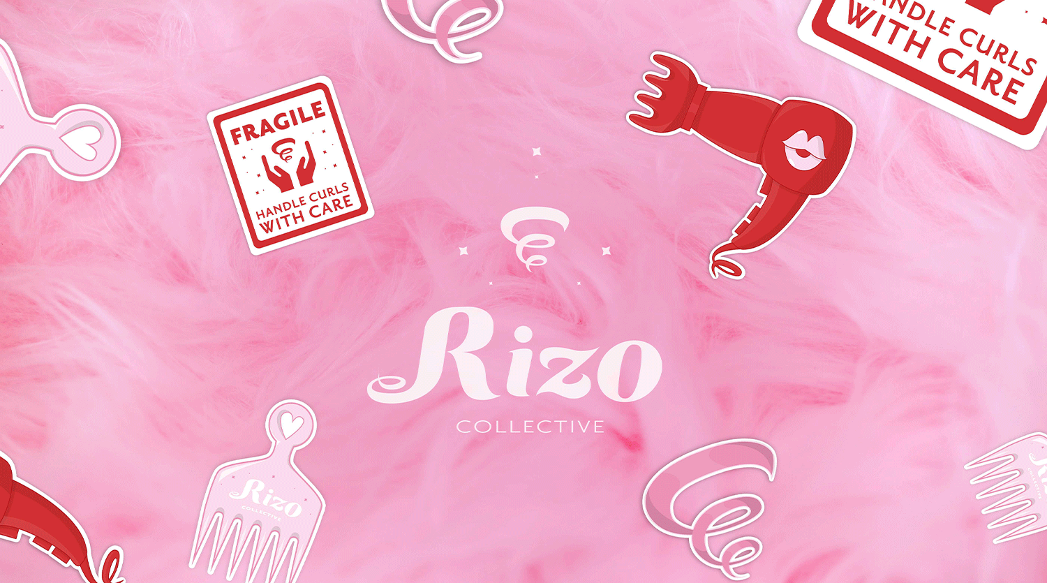
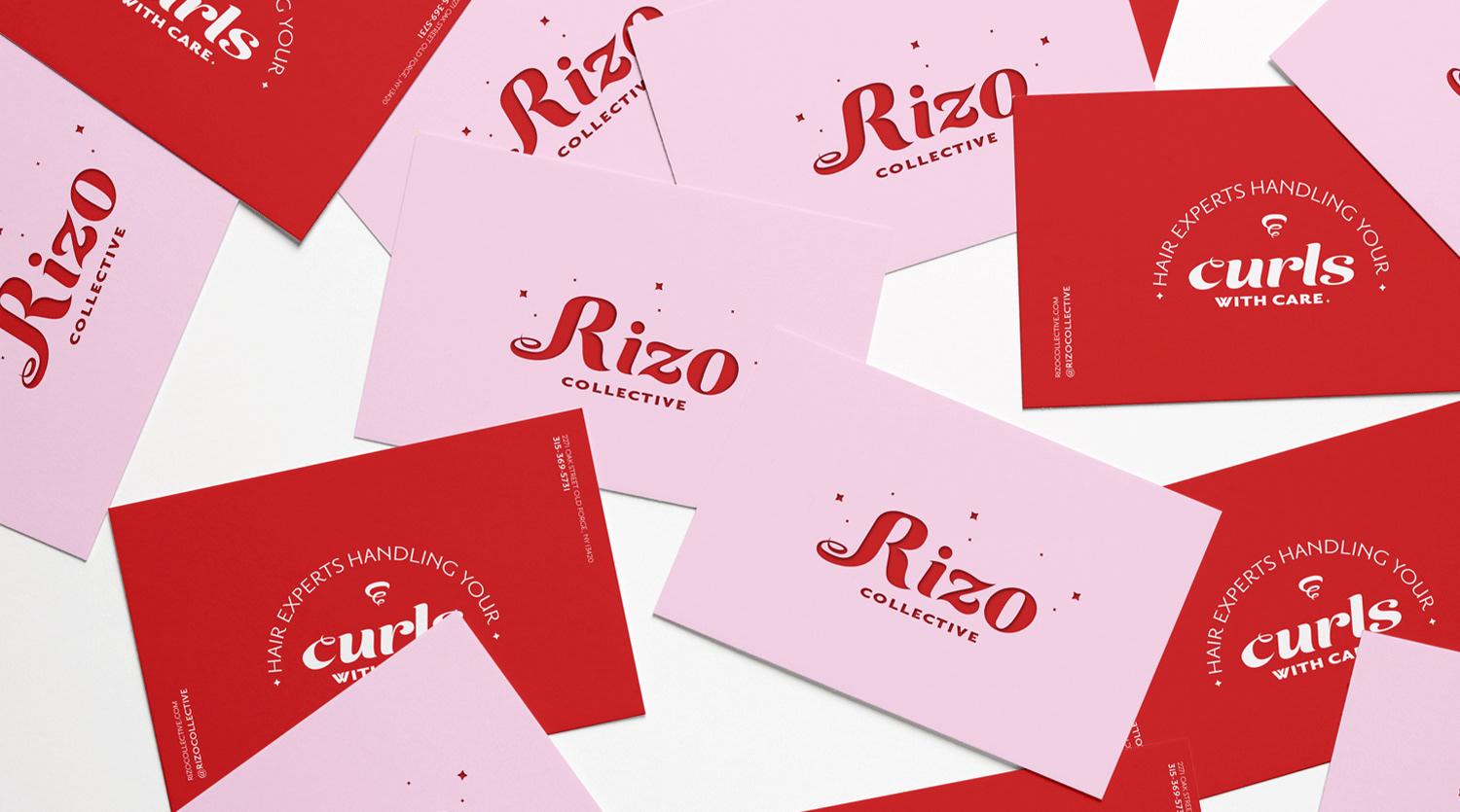
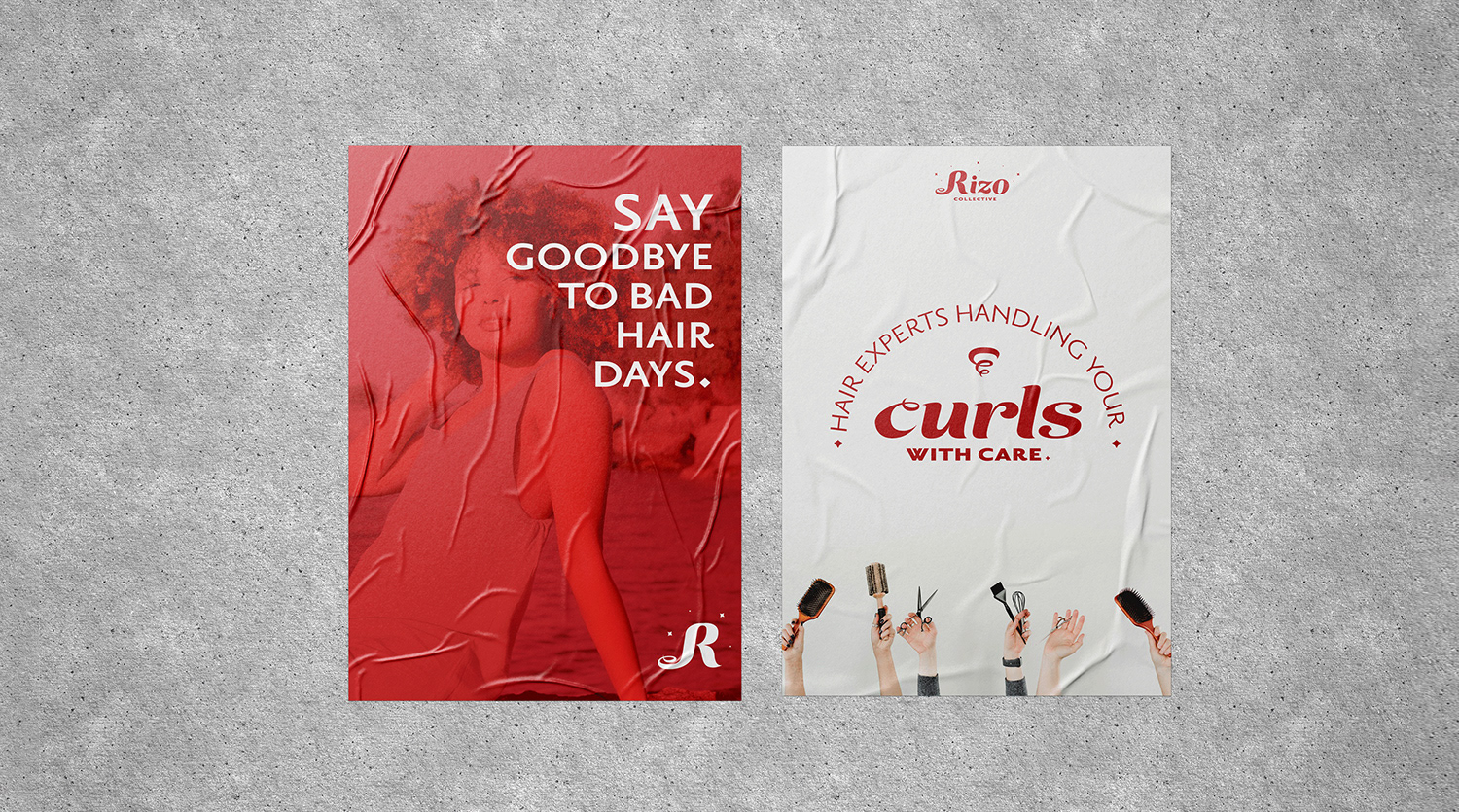
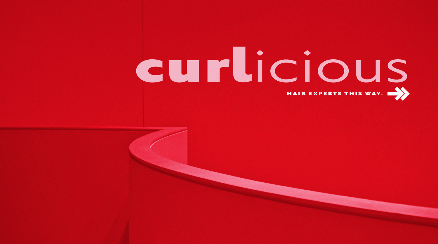
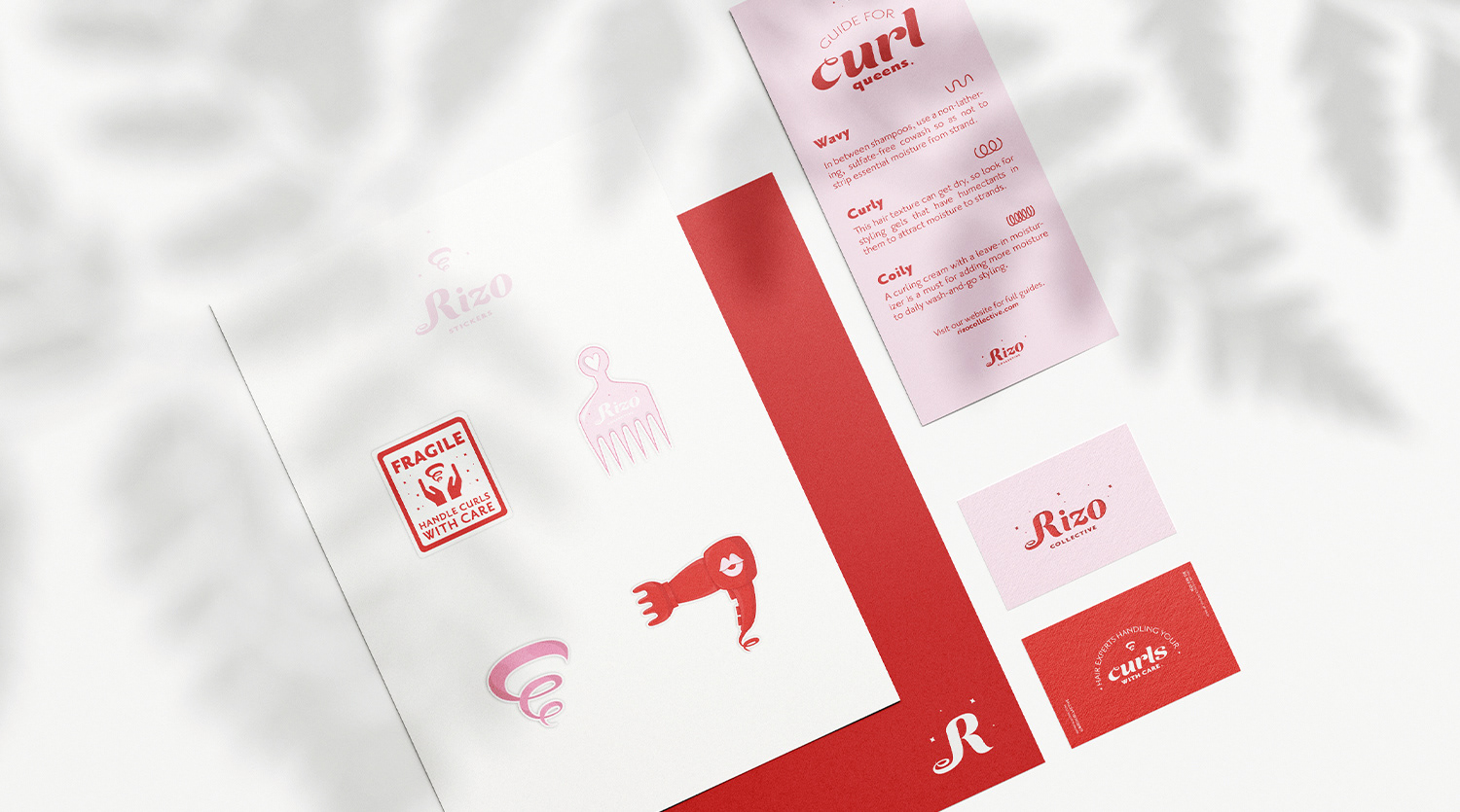
I was tasked with the development of the brand identity from the ground up, beginning with the target audience. I proposed focusing on femme-presenting individuals ages 20–30 who are eager to go natural but overwhelmed by where to start. Naming was next. Rizo, meaning "curl" in Spanish, was a great fit for the salon’s roots and mission. Pairing it with Collective communicates a sense of community. As a way to distinguish Rizo from traditional salons that often lack curl-specific knowledge, I crafted the tagline, “Hair experts handling your curls with care.”
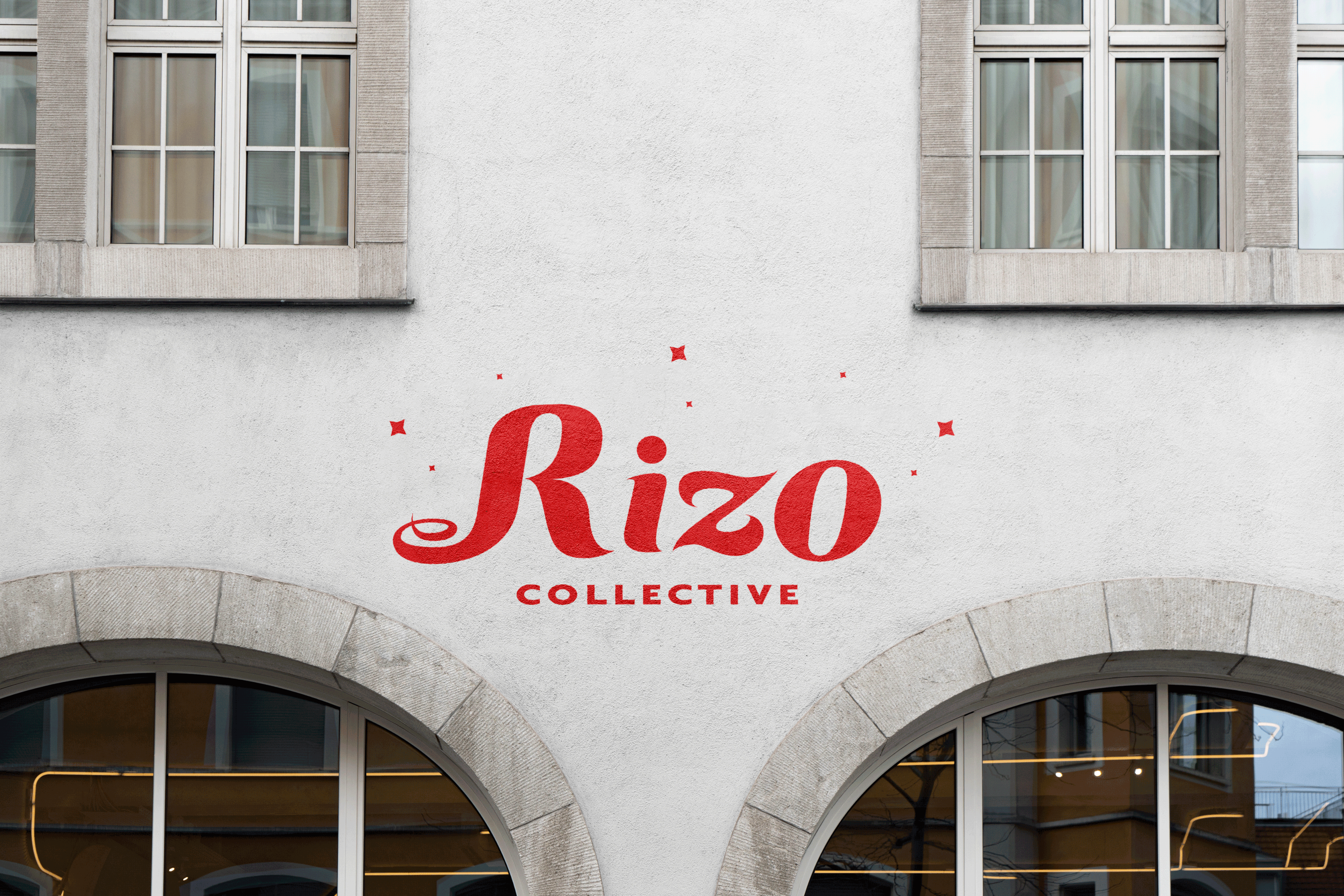
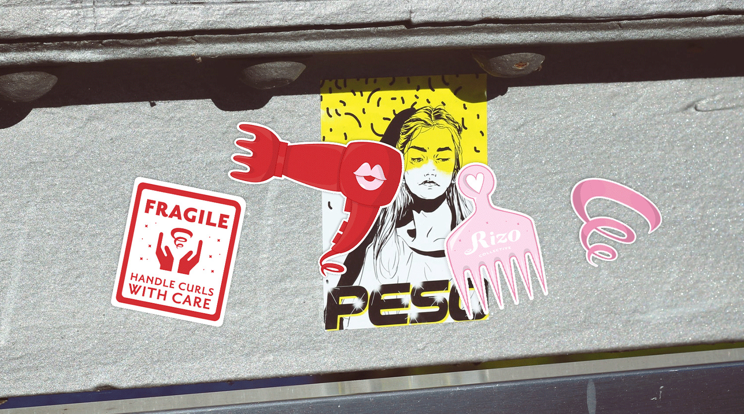
Visually, the brand needed to feel bubbly and playful while retaining a sense of luxury and femininity. I developed a juicy, flowing logotype using a customized script font, paired with a bold logomark featuring Rizo’s mascot—a luscious curl. The pink and red color palette amplifies the salon’s fun, feminine personality. Using this brand system, I designed print collateral and exterior signage that brought the visual identity into the physical space.